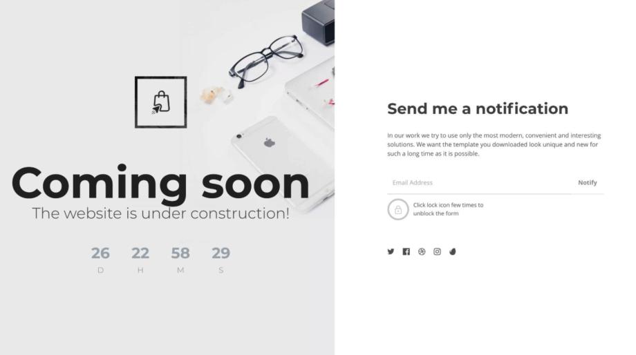
Responsive Web Design
Mobile-First Designs for Every Device
Ensure your website looks and performs perfectly on every device. Mobile-first, fast-loading design adapts seamlessly across desktop, tablet, and smartphone.
Responsive Design for All Devices
Every website is designed responsively, providing a seamless experience across desktops, laptops, tablets, and smartphones. Your site adjusts automatically to any screen size, delivering fast performance, clear layouts, and a consistent user experience everywhere.
- Mobile-First Layouts Optimized for Phones
- Clean, Scalable Design for Large Screens
- Adaptive Layouts That Fit Any Device
- Fast, Smooth Experience Across All Screens
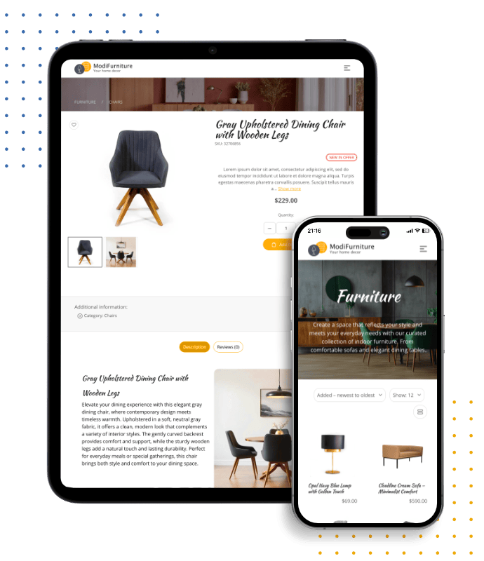
Extensions That Scale to Every Screen
Every module and extension - from forms and image galleries to product pages and blogs - is fully responsive out of the box. Each element is optimized to retain usability, readability, and style whether visitors are browsing on mobile, tablet, or desktop.
- Layouts auto-adjust to fit any screen dimension
- Touch-optimized design for mobile interactions
- Unified look and performance across devices
- Accessibility-ready and standards compliant

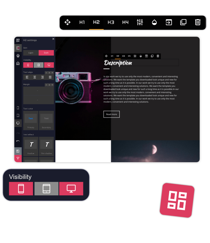
Check Your Site on Any Device Instantly
Switch between desktop, tablet, and mobile previews while editing in HitMe Builder. Spot issues before publishing, fine-tune layouts in real time, and make sure your design looks exactly the way it should across all screen types.
- Toggle between mobile, tablet, and desktop previews
- Review edits without leaving the editor
- Quickly detect and resolve layout inconsistencies
- Accurate previews that mirror real devices
Control Visibility Across Devices
Decide what content appears on mobile, tablet, or desktop. Hide unnecessary sections and optimize the flow of information per screen size, creating a clutter-free experience that boosts readability and keeps visitors engaged.
- Enable or hide blocks based on device type
- Provide tailored user journeys per device
- Streamline content for simpler navigation
- Enhance engagement with focused layouts

Fast, Responsive & SEO-Friendly
Clean, optimized code combined with responsive design ensures your site loads quickly and runs smoothly. Smart image handling, caching, and lazy loading improve site performance, reduce bounce rates, and help boost SEO rankings.
- Lightweight, optimized codebase for speed
- Lazy loading to improve initial load times
- Advanced caching for faster repeat visits
- SEO benefits through speed and responsiveness
Responsive Website Templates
Pick from modern, professionally designed templates with fully responsive layouts. Each template automatically adapts to desktops, tablets, and mobile devices, keeping your website clean, fast, and consistent on every screen.