Website Builder
Drag-and-Drop Website Builder with No Coding Required
Build professional websites with an easy drag-and-drop builder. Customize layouts, content, and design with full creative control—no coding required.
Customizable, Ready-to-Use Website Sections
Build your website faster with a library of professional, prebuilt sections. Explore categories like headers, testimonials, pricing, contact forms, hero banners, and more. Every section is mobile-optimized, fully editable, and ready to drop in - no design skills required.
- Pick from dozens of professional pre-styled sections
- Includes headers, testimonials, pricing, and more
- All sections mobile-ready and customizable
- Just insert, personalize, and publish instantly
Simple Drag-and-Drop Page Builder
Design layouts visually by dragging sections into place. Move, duplicate, or delete elements instantly. The drag-and-drop interface makes building websites easy, intuitive, and fun - even for first-time users.
- Drag sections directly into your page
- Quickly rearrange, duplicate, or remove blocks
- Beginner-friendly visual editor
- Live preview of every change you make
Website Builder Packages for Any Project
Choose from website builder packages tailored to projects of all sizes. From simple sites to feature-packed platforms, each plan provides the tools, flexibility, and performance needed to design, customize, and launch professional websites effortlessly.
- Ads-Free Experience
- Custom domain
- Storage space : 5GB
- Templates library
-
Social Media Management
: 1 Accounts per Social (Extendable)
- Photos library
- Images Editor
- Customer care : Standard support
- Email & Web Contact Forms
- Ads-Free Experience
- Custom domain
- Storage space : 10GB
- Templates library
-
Social Media Management
: 1 Accounts per Social (Extendable)
- Photos library
- Images Editor
- Customer care : Standard support
- Email & Web Contact Forms
- Ads-Free Experience
- Custom domain
- Storage space : 25GB
- Templates library
-
Social Media Management
: 2 Accounts per Social (Extendable)
- Photos library
- Images Editor
- Customer care : Priority support
- Email & Web Contact Forms
- Ads-Free Experience
- Custom domain
- Storage space : 10GB
- Templates library
-
Social Media Management
: 2 Accounts per Social (Extendable)
- Photos library
- Images Editor
- Customer care : Standard support
- Email & Web Contact Forms
-
eCommerce platform
- Limits of products : Unlimited
- Secure online payments
- Multiple types of products
- Currencies
- Third-party payment fees : 1%
- Card and bank payments
- Coupons system
- Invoice System
- Sell on social channels
- Sell on marketplaces
- Ads-Free Experience
- Custom domain
- Storage space : 20GB
- Templates library
-
Social Media Management
: 2 Accounts per Social (Extendable)
- Photos library
- Images Editor
- Customer care : Priority support
- Email & Web Contact Forms
-
eCommerce platform
- Limits of products : Unlimited
- Secure online payments
- Multiple types of products
- Currencies
- Third-party payment fees : 1%
- Card and bank payments
- Coupons system
- Invoice System
- Sell on social channels
- Sell on marketplaces
- Ads-Free Experience
- Custom domain
- Storage space : 50GB
- Templates library
-
Social Media Management
: 3 Accounts per Social (Extendable)
- Photos library
- Images Editor
- Customer care : Priority support
- Email & Web Contact Forms
-
eCommerce platform
- Limits of products : Unlimited
- Secure online payments
- Multiple types of products
- Currencies
- Third-party payment fees : 1%
- Card and bank payments
- Coupons system
- Invoice System
- Sell on social channels
- Sell on marketplaces
- Ads-Free Experience
- Custom domain
- Storage space : 10GB
- Templates library
-
Social Media Management
: 2 Accounts per Social (Extendable)
- Photos library
- Images Editor
- Customer care : Standard support
- Email & Web Contact Forms
-
eCommerce platform
- Limits of products : Unlimited
- Secure online payments
- Multiple types of products
- Currencies
- Third-party payment fees : 1%
- Card and bank payments
- Coupons system
- Invoice System
- Sell on social channels
- Sell on marketplaces
- Ads-Free Experience
- Custom domain
- Storage space : 20GB
- Templates library
-
Social Media Management
: 2 Accounts per Social (Extendable)
- Photos library
- Images Editor
- Customer care : Priority support
- Email & Web Contact Forms
-
eCommerce platform
- Limits of products : Unlimited
- Secure online payments
- Multiple types of products
- Currencies
- Third-party payment fees : 1%
- Card and bank payments
- Coupons system
- Invoice System
- Sell on social channels
- Sell on marketplaces
- Ads-Free Experience
- Custom domain
- Storage space : 50GB
- Templates library
-
Social Media Management
: 3 Accounts per Social (Extendable)
- Photos library
- Images Editor
- Customer care : Priority support
- Email & Web Contact Forms
-
eCommerce platform
- Limits of products : Unlimited
- Secure online payments
- Multiple types of products
- Currencies
- Third-party payment fees : 1%
- Card and bank payments
- Coupons system
- Invoice System
- Sell on social channels
- Sell on marketplaces
Seamless Blog Features
Integrate a blog effortlessly into your website. Display posts in grids, carousels, or widgets, and let auto-updating blocks keep your site fresh with the latest content - without extra work.
- Insert blog content anywhere on your website
- Choose grid, carousel, or widget layouts
- Content auto-updates across your website
- Keep audiences engaged with new content
Display Products Anywhere
Highlight your products with stylish, customizable blocks. Organize them by “New Arrivals,” “Best Sellers,” or “On Sale.” Choose between sleek grid views or sliders to maximize customer engagement and sales.
- Feature products anywhere on your website
- Organize by category, sales, or new arrivals
- Choose between grid or slider displays
- Drive conversions with visual product blocks
Responsive Design Across All Devices
Every HitMe site automatically adapts to mobile, tablet, and desktop screens. All templates and sections are optimized for responsiveness, so users enjoy a smooth experience everywhere.
- Optimized for every screen size and device
- Templates built with mobile-first design in mind
- Ensure a seamless user journey on all devices
- Automatic adjustments for phones, tablets, and desktops
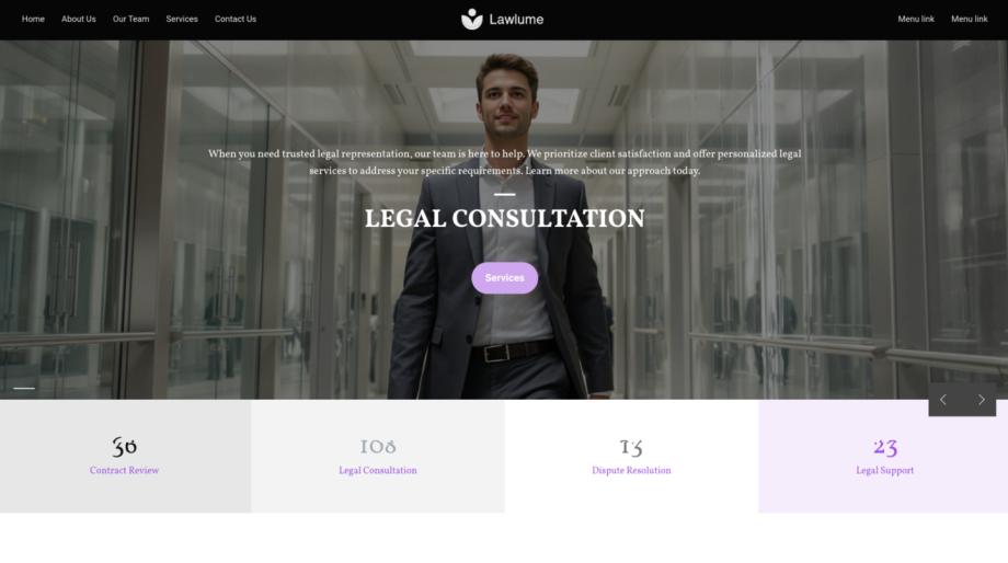
Industry-Specific Templates to Launch Faster
Jumpstart your project with professionally designed templates for industries ranging from personal portfolios and restaurants to healthcare, technology, and more. Pick your template, make edits, and publish - it’s that simple.